Branding Project
McGreevy Construction
I love a challenging branding project, starting from scratch. With McGreevy Construction I was given a blank canvas. Their goal was to convey strength, structure and confidence through this new brand identity, so my design nodded to architectural drawing and planning - the concept end of construction and the area where they are particularly strong. The new look was rolled out over the web along with marketing material. It also included the branding of their fleet of machinery and safety equipment on each of their live sites.
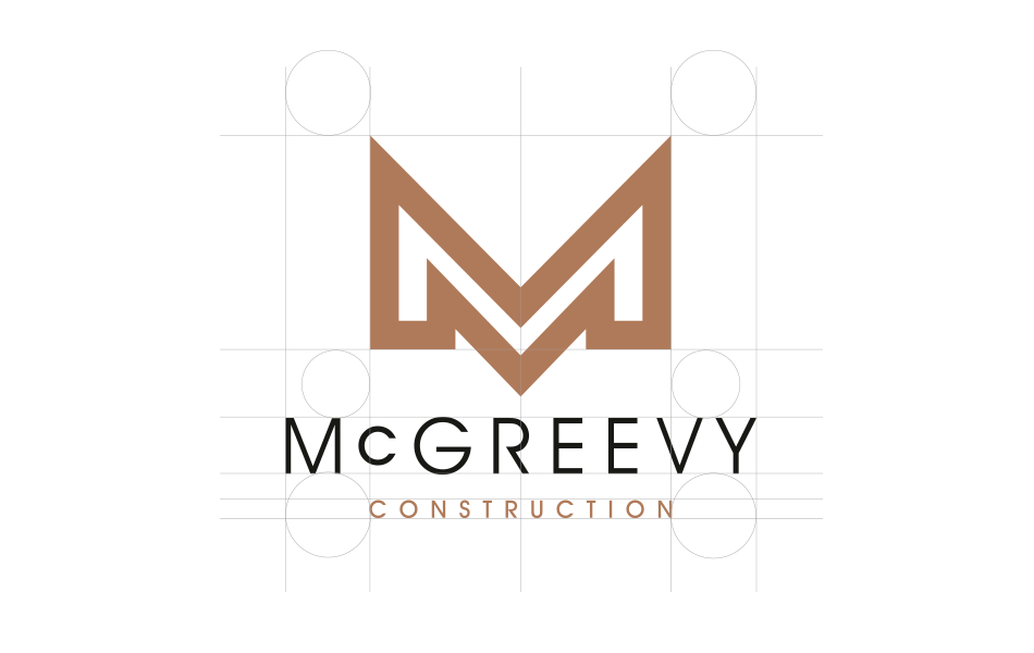
I developed a strong brand mark for McGreevy’s using the structure of the letter ‘M’ in a classic, elegant typeface, using wider, art-deco-style latter spacing to underline the heritage of the company.
This had to work as a standalone logo and as part of the identity suite, so the strength and singularity of the image was critical to get right.
The result was a stylish, distinctive identity in black, gold and silver, that immediately sets them apart from other construction firms and conveys all of the positive attributes you would expect from a leading player in this ultra-competitive sector.


